


❌ The Menu Mistakes Draining Your Margins
A well-engineered menu can sharpen your brand and boost your bottom line without raising prices. Here’s how…

🌞 Welcome to this Week's Newsletter
Your menu could be a stronger tool in your marketing arsenal. In fact, research from the Journal of Tourism and Gastronomy Studies shows that well-engineered menus can increase profitability by up to 15%. Yet most menus grow by default: inherited templates, rushed updates, or ‘something for everyone’ bloat.
This guide explains how to apply psychology, structure, and data-driven insights to turn a passive menu into a strategic growth driver. Whether you’re running a single venue or managing multiple sites, menu engineering can sharpen your positioning, reduce friction, and raise profit, without raising your prices.
Are you ready to maximise your margins?
Let’s Check In ☕
📜 Menu Engineering 101
Menu engineering is a strategic process which influences customer choices to drive profitability. Combining pricing psychology, strategic positioning, tactical messaging and graphic design, restaurants can optimise their menus to guide diners toward high-margin items.
Menu engineering goes hand in hand with creating a strong brand, and when done correctly, this strategy enhances both the customer experience and your bottom line.
In fact, the biggest menu mistake is not engineering.
But before you can guide diners toward high-margin dishes, you need a menu that doesn’t make them want to give up halfway through. That’s where many restaurants go wrong. They don’t have an engineering problem, they have an overwhelm problem.
🤯 How Menu Complexity Undermines Profitability
Although it's great to present people with choices, there's a point where it becomes overwhelming for some when presented with too many options.
Menus that feel cluttered or unstructured confuse diners and distract from your brand story. A menu overloaded with options can weaken the connection between the customer and your restaurant’s identity. Instead of choosing a high-margin dish, customers may gravitate to familiar, low-margin options.
I once worked with a cafe with over 200 items on its menu. Their idea was clear, something for everyone. But the result was a confused kitchen, slower service, and guests who couldn’t tell what the business stood for.
You need to know which items are pulling their weight. That’s where the Cost Margin Analysis Model comes in.
📊 Cost Margin Analysis Model
A well-placed, high-profit dish can do much more for your revenue than one that’s tucked away.
The Cost Margin Analysis Model assesses each dish based on its contribution margin in the late 1970s; this concept aims to help restaurateurs optimise their menus and enhance profitability by analysing both the cost and popularity of menu items. This dual focus allows restaurants to move away from guesswork and make informed, data-driven decisions.
First, you need to calculate the profit margins for each dish. Start by calculating each dish's Cost of Goods Sold (COGS), including the ingredients and supplies used to make it. COGS does not include overheads, staff costs, or other operating expenses like rent, utilities, or marketing.
Use this simple formula to calculate the profit margin for each dish:
Profit Margin = Selling Price - COGS
For example, if a dish costs £5 to make and sells for £20, the monetary margin would be: £20 - £5 = £15
If you prefer a statistical approach:
Profit Margin = (Selling Price - COGS) ÷ Selling Price × 100
For example, if a dish costs £5 to make and sells for £20, the profit margin would be:
(£20 - £5) ÷ £20 × 100 = 75%
This method allows you to track dish profitability over time.
Once you have calculated your margins, you can start categorising menu items within the Menu Engineering Matrix:

Stars: High sales and high-profit margins. These dishes usually have a profit margin of 60% or higher and are your top sellers. They drive revenue and should be promoted heavily.
Plough Horses: High sales but lower profit margins. These dishes typically have a profit margin of 30% to 50%. While they sell well, they may need a price adjustment or cost management to improve profitability.
Puzzles: High profit margins but low sales. These dishes have a profit margin of 50% or higher but sell less frequently. Consider promoting them more to increase visibility and sales.
Dogs: Low sales and low-profit margins. These dishes generally have a profit margin of under 30% and are low performers. These dishes may need to be reworked, re-priced, or removed from the menu altogether.
Your final matrix may look something like this…

In Leslie’s Cafe, dishes like Avocado Toast and Flat Whites sit in the Star quadrant—they’re profitable, popular, and brand-aligned. The Plough Horses, such as the Full English and Chocolate Fudge Cake, are beloved staples but costlier to produce. Items like Quiche Lorraine and Macaroons are Puzzles they carry good margins but don’t sell often, so their position needs rethinking. Then there are the Dogs, menu bloating items like Prawn Linguine or Spaghetti Carbonara, added in a panic to boost sales. They don’t fit the brand, rarely sell, and cost more than they earn. The more Dogs on your menu, the more they drag everything down.
Now that you’ve categorised your items, it's time to look at strategic menu design.
🔬 The Science of Menu Design
Effective menu design goes beyond aesthetics to guide diners’ choices, highlighting the dishes that drive profitability while ensuring an intuitive, easy-to-navigate experience. An effective menu layout can boost sales, speed up decision-making, and enhance the overall dining experience.
But before you start thinking about fonts and colour schemes, the first step is understanding how people read menus.
🤝 Grouping Items
Breaking decisions into smaller steps improves the customer experience. Instead of overwhelming diners with a long list of dishes, structuring choices into intuitive sections helps reduce cognitive load and speeds up decision-making.
Grouping dishes into categories like Brunch Favourites, Lighter Bites, or Sweet Treats gives diners a clear path to follow, making the menu feel simpler, even if the number of items stays the same.
When done well, chunking transforms your menu from a long list into a guided journey. Diners feel more confident, experience less decision fatigue, and are more likely to order with satisfaction.
Once your menu is logically grouped, the next step is guiding the eye, because how diners look at it shapes their choices. That’s where Gaze Motion Theory comes in.
👀 Gaze Motion Theory
Diners don’t read menus—they scan them. Eye-tracking research shows that most diners follow an F-shaped or Z-shaped scanning pattern. This means they start at the top left, sweep across, and then drop down the left or centre. These scanning patterns create natural hotspots—typically the top-left, top-centre, and bottom-right.
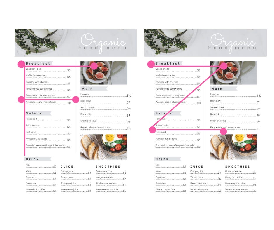
These areas are prime real estate for your high-margin or signature dishes, as they’re where diners’ eyes are most likely to land first. Placing your most profitable or standout dishes in these zones increases the chances of them being noticed and selected.
Avoid placing key items in areas that attract less attention, such as the menu's middle left or bottom centre. A profitable dish placed in a low-attention zone won’t get ordered as much, no matter how great it is. Your menu layout should guide the eye as deliberately as your front-of-house team guides the guest experience.
Cultural Considerations
When designing your menu, it’s essential to consider the reading styles of different cultures. For diners who read from right to left, such as those from Arabic or certain Asian cultures, the F-shaped or Z-shaped patterns will be reversed.
In these cases, you should place key items in the top-right, top-centre, and bottom-left areas to accommodate the natural flow of their reading pattern. A well-considered design that respects these differences ensures a seamless experience for all guests.
Once you understand how diners scan a single page, it’s time to apply that logic to multi-panel layouts. Whether your menu folds in half, thirds, or more, each panel draws a different level of attention, and smart placement can turn passive panels into high-performing sales zones.
📄 Panel Placement
In a two-panel layout, the right-side panel typically draws the most attention, while the left side is less focused. The three-panel menu follows a similar pattern, with the third panel being the most engaging. For menus with many panels, the top of each page grabs the most attention, with the least focus given to the lower sections of each panel.

Placement within each section matters as much as overall positioning. That’s where the primacy and recency effects come into play, because diners remember the first and last things they see.
🧠 Primacy & Recency Effect
Diners focus on the first and last items in any menu section, a behavioural bias known as the primacy and recency effects. The first item captures immediate attention; the last benefits from a final pause. These are prime positions for high-margin, high-desire dishes.
Middle items often blur into the background unless visually emphasised, so placement alone won’t do. Use bold text, subtle callouts, or contrast carefully to anchor attention without overwhelming the layout.
If everything stands out, nothing does.
Now that you’ve identified your high-margin items and grouped them, here’s how to apply primacy and recency within each section:
Start strong: Open each category with a reliable performer—something with broad appeal, high profitability, or strong brand association.
End memorably: Place a second high-margin dish at the end. This can be a signature item, an indulgent upgrade, or a seasonal special.
Hide your fillers: Place low-margin or utility items in the middle. They remain accessible without stealing focus.
Support the centre: If you must include a dish mid-section, draw the eye with a single, restrained visual cue—like an icon, chef’s note, or soft background tint.
Segment longer lists: For sections with more than six items, break them into sub-groups. This resets the primacy/recency effect and gives you more opportunities to feature top dishes.
Test and refine: If a high-margin dish isn’t selling despite good placement, review how it’s described and displayed. The position draws the eye, but the copy closes the sale.
💰 How Price Placement Influences Buyer Behaviour
Once you’ve structured the decision path and guided the eye, the next layer to consider is the price, because how it's positioned changes how it's perceived.
📍 Price Placement
Where the price appears on the menu significantly influences how diners make choices. When prices are listed in a separate column or placed far from the dish name, they become a visual barrier, prompting diners to compare numbers rather than dishes. This often leads to second-guessing or, worse, defaulting to the cheapest option.

Instead, keep the price close to the dish name to present it as a complete offer. For example:
Patatas Bravas | £6.00
Chorizo al Vino | £7.50
Piquillo Peppers | £8.00
Croquetas de Jamon | £6.50
Gambas al Ajilo | £9.00
This keeps the focus on the food, not the price tag, and encourages diners to engage with the dish itself rather than focusing on its cost.
⚓Price Anchoring
Price anchoring works by using one item to make another look like better value, helping guide diners to the option you want them to choose.
For instance, placing a high-margin £18 pasta next to a £24 seafood special makes the pasta appear more affordable.
However, avoid placing that same £18 pasta next to a £14 risotto. In this case, the risotto becomes the anchor, making the pasta look overpriced and shifting focus away from the more profitable dish.
Anchoring only works when the comparison is deliberate—get it wrong, and you risk drawing attention to the wrong dish.
🎭 Decoy Pricing
Decoy pricing shifts buyer perception, nudging customers towards higher-margin options without direct price hikes. You’ll see this used in most coffee shops.
Here, the Medium Coffee acts as the decoy. While the Small Coffee is £2.50, the Medium Coffee at £4.00 feels overpriced in comparison, especially considering the Large Coffee is only 50p more. By placing the Large Coffee at £4.50, the price difference between the Medium and Large makes the Large Coffee look like the better value.
The Medium appears to be an unattractive option now, and customers are more likely to opt for the Large, which brings in a higher margin for the business. The decoy is strategically priced to push customers toward the more profitable choice.
🔄 Currency and Rounding
The classic .99 ending is used in retail to create the illusion of a bargain. For example, £9.99 feels closer to £9 than £10, even though the difference is minimal.
In hospitality, removing this can help position your menu as higher-end, appealing to diners who associate rounded figures with quality and premium experiences.
Many premium venues remove currency symbols and use rounded numbers instead, such as changing “£17” to just “17.” This simple change can signal confidence, elevate perceived value, and align with a more refined brand experience.
Patatas Bravas | 6
Chorizo al Vino | 8
Piquillo Peppers | 8
Croquetas de Jamon | 7
Gambas al Ajilo | 9
Once your pricing is positioned to support value perception, the next step is knowing which dishes to pull back from. Not every item deserves the spotlight—and that’s where demarketing becomes a strategic tool.
🗝️ Join Me in the VIP Lounge 🔒
This month’s VIP section focuses on digital menu optimisation, covering
Optimising Digital Menus
Demarketing
Behavioural Patterns
Accessibility
Neuromarketing Tactics
Dynamic Pricing
Phygital Design.
It’s where hospitality professionals come to refine their approach, align strategy with guest behaviour, and make smarter decisions without guesswork.
Let’s get to work 👇
📈 Optimising Digital Menus
Keep reading with a 7-day free trial
Subscribe to Hospitality Marketing Insight to keep reading this post and get 7 days of free access to the full post archives.